Creating a sophisticated yet easy-to-use product configurator
Project Overview
Project Type
Starting as a CX Audit of their existing website, I demonstrated a deep understanding of the customer, experience and product and was asked to do a detailed Discovery and Design project for a completely new website with a highly bespoke product configurator. I was the sole UX designer on this design and build project.
Client
- + Bloc Group
- + John Bann-Lavery, Ecommerce Manager + Colette Wilson, Head of Marketing
Working With
- + WIRO Agency
- + Brand Design by Fluent Format
Problem statement
Bloc Blinds were seeing massive drop-offs on the customisation screens of their flagship product; award-winning blackout blinds, leading to a much lower conversion rate compared to simpler products in their range.
While the BlocOut blinds are an innovative product, the customisations and measuring requirements were too complex for the layman to navigate.
Research & Discovery
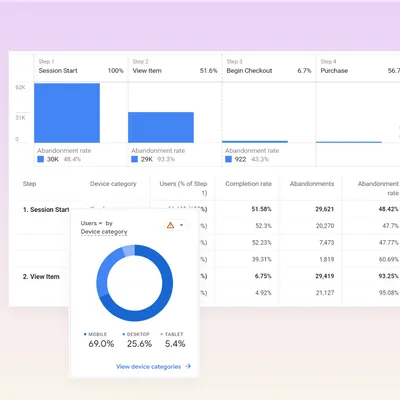
Data and funnel analysis
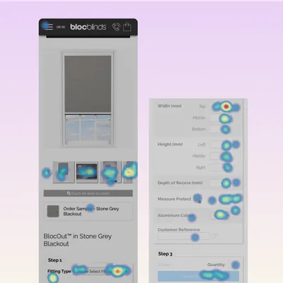
Heatmap analysis
Usability testing
Customer surveys
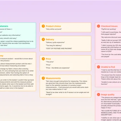
Key Findings
- Customers weren’t convinced on why or how these blinds are different to other blinds (Usability testing)
- Customers didn’t understand the difference between blind types (Usability testing)
- Customers were dropping out of the long form to customise their blind before completion (Heatmap analysis)
- Customers wanted a ballpark idea of costs before committing their time to filling out a lengthy form (Customer exit survey)
- Customers didn’t always understand the questions in the blind configurator (Customer exit survey)
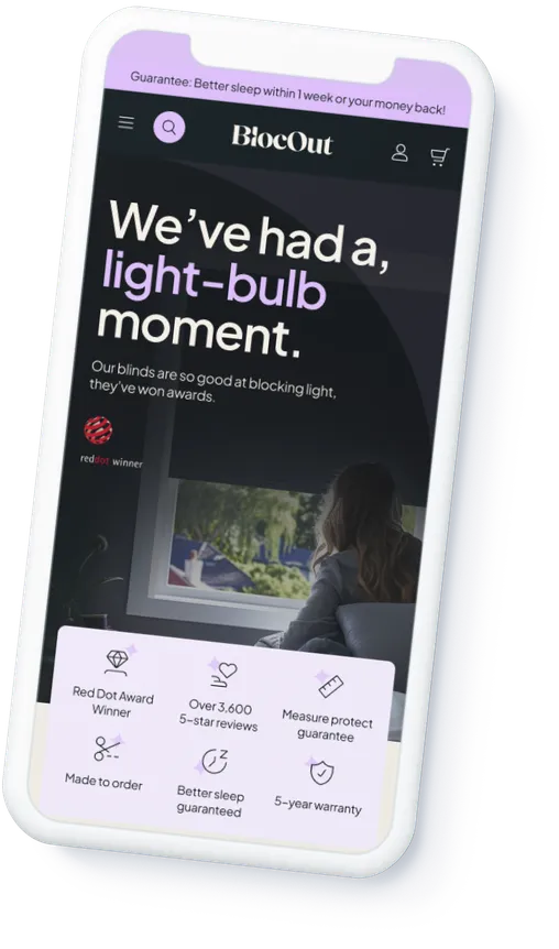
- The dated website design didn’t feel premium enough to justify the cost of the product (Usability testing)
- Customers stated that they were turned off by image quality (Customer exit survey)
- Customers had insufficient information to feel confident to purchase (Usability testing)
- Customers didn’t realise there was a Smart option until asked at the end of the form, and even then didn’t understand the capabilities or what hardware was included (Usability testing)

Strategy
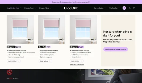
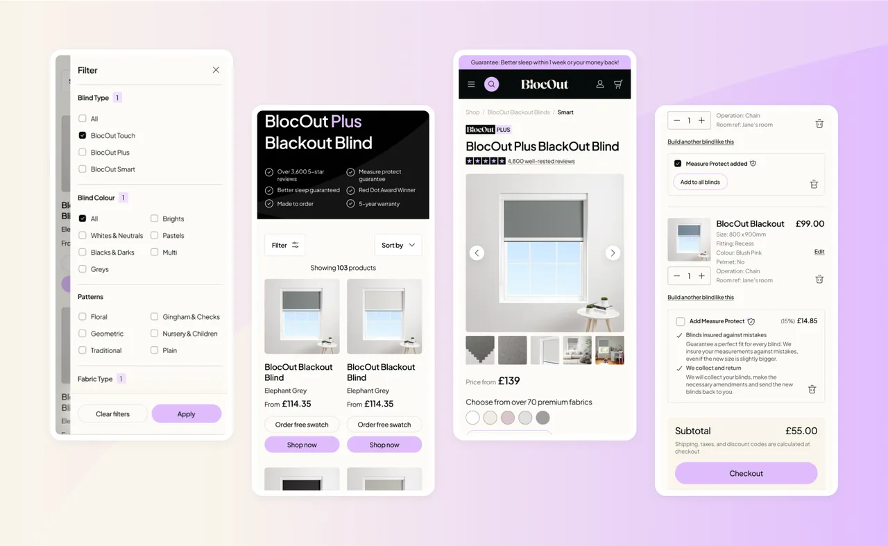
Rename the products
Previously called BlocOut and BlocOut XL, you’d think the only difference was the size, but that’s not the case. I proposed renaming these to better explain and promote their key selling points:
- BlocOut Touch emphasising their simple and child-safe, no-cord design
- BlocOut Plus a thicker frame, suitable for more window types, with different operating options BlocOut Smart with smart home integrations
- BlocOut Smart with smart home integrations
Crucially, incase the user still isn’t sure, I have devised the step-by-step configurator to figure out the correct type based on your answers.
...but don’t expect customers to learn everything about them!
The finer details of the BlocOut blinds are complicated. But the pay-off for getting the right one is huge.
After thinking about how to ensure customers chose the right one every time, I realised we couldn’t.
We needed to avoid:
- customers getting confused
- ending up frustrated by starting to configure a blind which ultimately wasn’t going to be right
- missing opportunities to up-sell pelmets, motors and smart hubs
We needed to offer:
- flexibility; whether the customer started the process knowing what they wanted from a practical or technical point of view or just knew what colour they wanted
- a quick quote based on the rough size of their window; nobody wants to fill out a long form when they feel it might be a waste of time if the price isn’t suitable
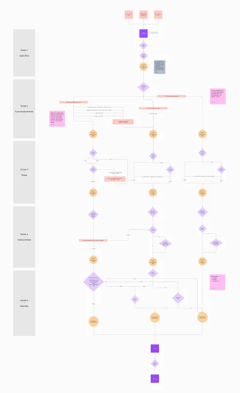
The answer was to make a single configurator which could guide you to change between the 3 blind types if needed, without having to start again from the beginning.
I created this flow diagram which formed the basis for the scope of work and wireframes. I worked closely with the technical team at Bloc Blinds to confirm the structure of the configurator and to ensure the most straightforward solution for customers. Our own developers also used this to plan how they’d query the API.
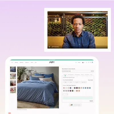
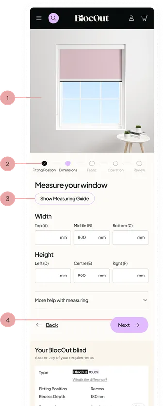
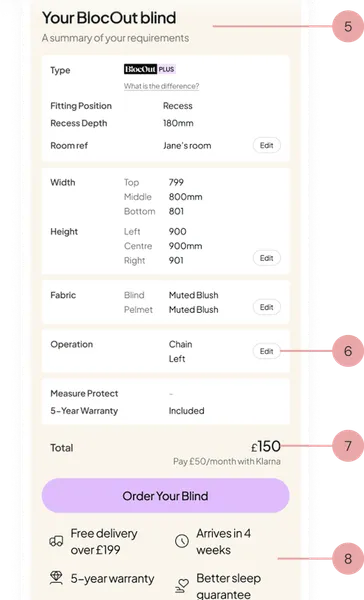
Step-by-step configurator
- Computer-generated blind images which update based on form inputs
- Progress indicator to help users understand the stages in process
- Measuring guides to help ease user uncertainty and frustration
- Clear call-to-actions to encourage progression
- Summary of entered information with running price total
- Clear edit functionality of entered information with running price total (off-screen)
- Updating price so customers can evaluate choices based on price
- Trust signals to reassure customers as they consider adding to cart
"We can consider the designs approved. @Ruth Gwilt has clearly done a truly outstanding job. Thank you, Ruth."
John Bann-LaveryEcommerce Manager, Bloc Blinds