Introducing the UK's newest higher education institute
Project Overview
Project Type
Full website design and build
When our agency started working with NMITE, it was a brand new education institute with no existing website, no brand, a curriculum still being written and still awaiting higher education validation status.
I worked closely with their director, head of IT and head of marketing to meet an ever-changing set of requirements, delivering website iterations in stages.
I translated their requirements into wireframes and technical specifications, then lead the delivery through UI design and development.
Client
- + NMITE (New Model Institute for Technology and Engineering)
Working With
- + eighteen73 (formerly Orphans)
- + Branding by external agency
- + Creative/UI Design by Simon Hammond and Jack Graham
About NMITE
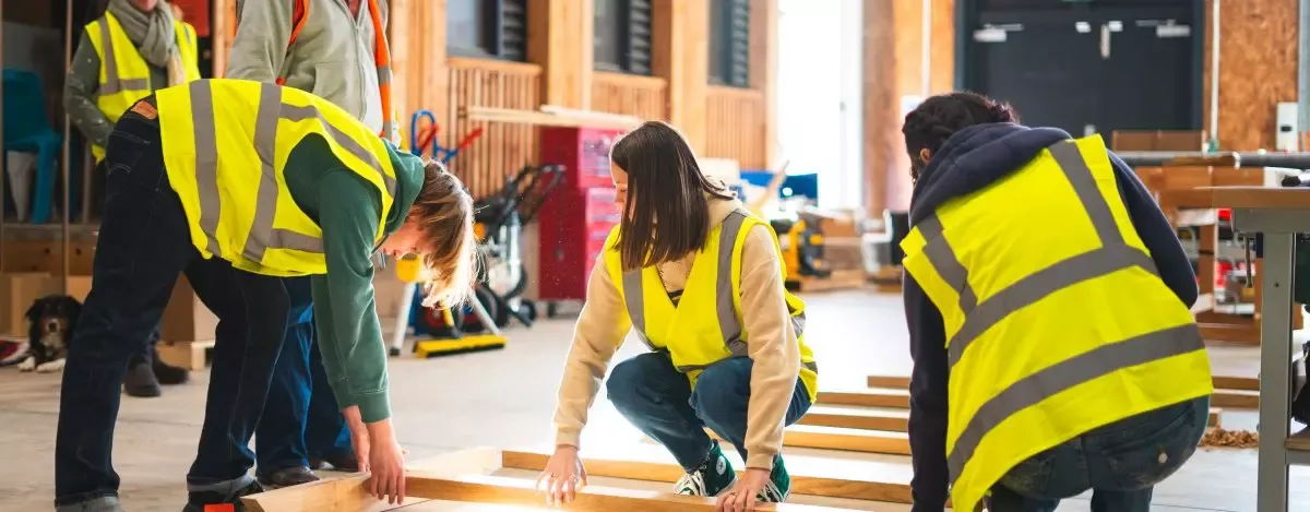
NMITE was a brand new, revolutionary force in higher education delivering:
- a full Masters in Engineering course in 3 years due to no summer breaks
- timber frame engineering courses based on a need in the local economy
- enhanced support for demographics under-represented within the engineering industry
Brief
To deliver a website with:
- a dynamic design while also being accessible to AA standard
- a content management system allowing custom templates with a block editor and permissions workflows (Drupal)
- a bespoke student application system allowing student to return for follow-up stages if and when successfully approved
Strategy
Planning for change
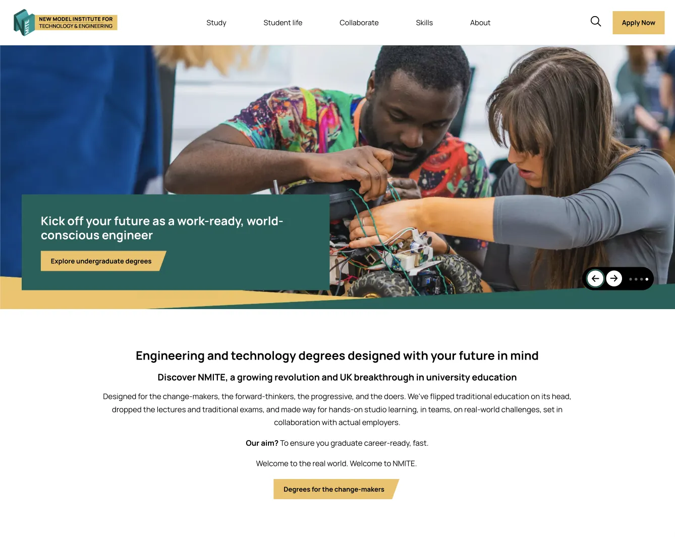
NMITE’s story was still being written as we were creating the website. Since the first iteration of the site launched, they have completely changed their offering from having one single MEng programme to a selection of courses including sustainable construction. I devised and wireframed block elements and a flexible menu design to allow them to adapt and grow to changing requirements.
Accessible colours
The first iteration of NMITE’s new branding was full of strong punchy greens and oranges. However none of these colours would work with either black or white text overlaid. The marketing team didn’t want to be limited to black and white backgrounds for text so we suggested new yellows and dark greens which would provide accessible contrast with black and white text respectively.
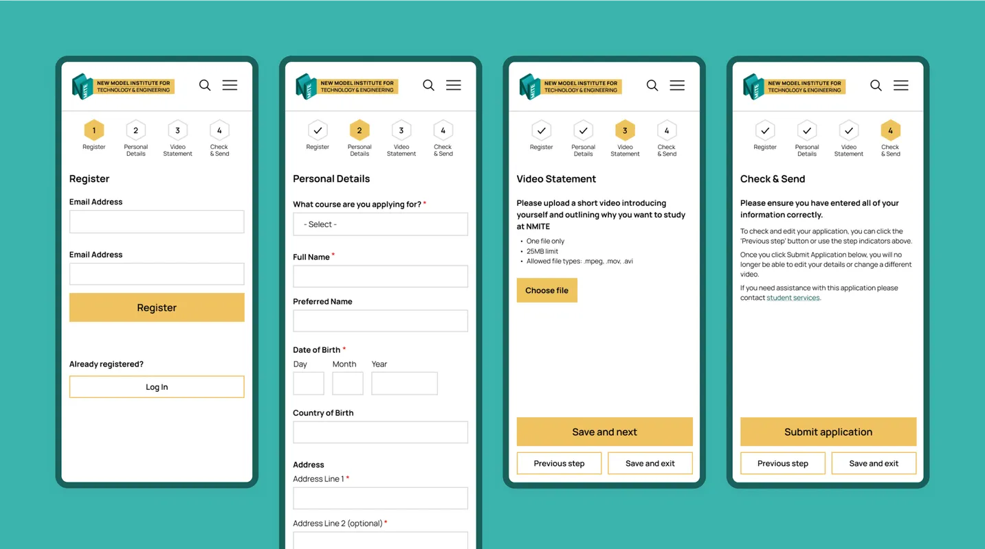
Student applications
Applications for NMITE weren’t going to run through UCAS; they had a very different idea of how applications should work. Students would do a first stage interview with standard personal questions then upload a three minute video about themselves. We decided this form needed to allow users to save progress and return, especially for those who needed to supply supporting documentation.
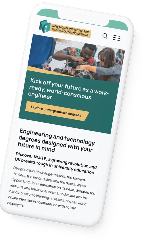
The system would then need to allow the admissions team to flag whether a student would proceed to the next round of the application process. Students would then get an email inviting them to log back in to complete their application. I designed the application screens mobile-first, assuming the target demographic was likely to use a mobile device, particularly for video uploads.