Maximising conversions for a growing lifestyle brand

Project Overview
Project Type
Collaborating on a long-term CX growth retainer, I work closely with Piglet in Bed's in-house ecommerce team.
I audited their complex Shopify site, suggesting and defining initiatives to improve the customer experience and increase revenue.
Client
- + Piglet in Bed
- + Jonathan Turton, Ecommerce Manager
Working With
- + WIRO Agency
Conversion Uplift Achieved!
through product page redesign
Research & Discovery
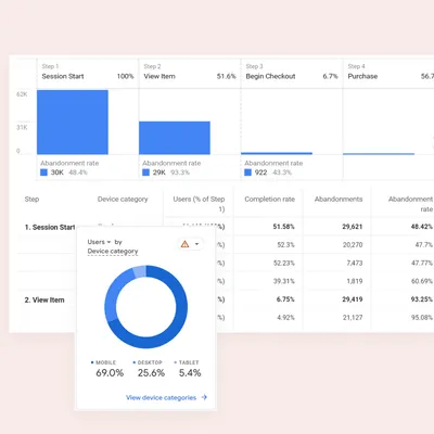
Data and funnel analysis
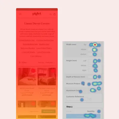
Heatmap analysis

Usability testing
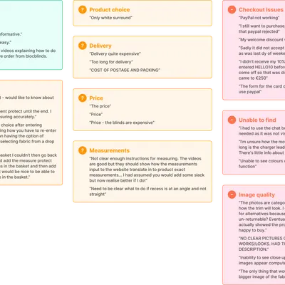
Customer surveys
Key Findings
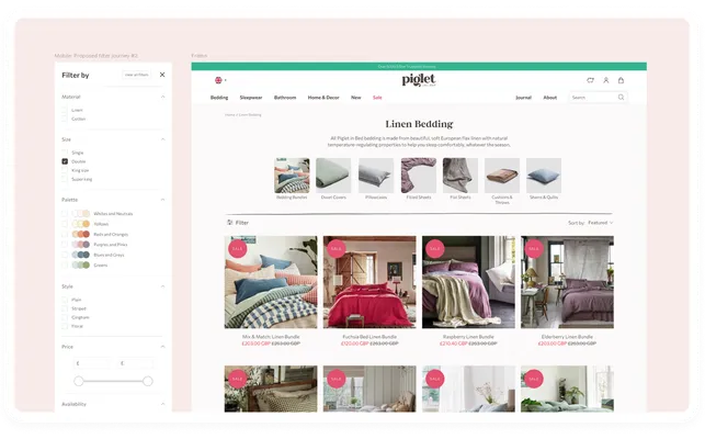
Finding product; navigation, collections and filtering
- Product views per session were low across devices (observed in GA and Shopify Analytics)
- Scroll depth was low on collection pages with few clicks after the first 4 products (observed in heatmaps)
- Customers wanted to filter by bedding size (observed in usability testing and customer exit surveys)
- Customers wanted to filter by colour (observed in usability testing)
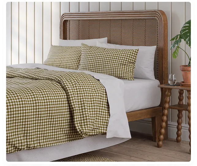
Product pages (single)
- Product add to cart rate was low from product pages, particularly on mobile (observed in GA and Shopify Analytics)
- Customer often weren't seeing customer reviews as they weren't scrolling far enough down product pages (observed in heatmaps)
- Customers weren't sure about quality of materials or provenance due to lack of storytelling (observed in usability testing)
- Customers on mobile didn't realise there were further product images beyond the first featured image (observed in heatmaps and usability testing)
Product pages (bundle)
I ran some user tests focused solely on the bundle builder, recruiting highly-relevant users with Respondent.io. Using Lookback to facilitate an unmoderated step-by-step usability test, I asked users to compare the Piglet in Bed bundle builder to the equivalent functionality of a leading competitor.
-
Customers felt
unsure about selected colours based solely
on small swatch circles. This often caused them to exit the
bundle builder to find imagery elsewhere on site
Customers preferred how the competitor site used computer-generated imagery to show linen colours together - Customers preferred the flexibility of the PIB bundle builder which, unlike the competitor, didn't force you to buy an item from each step
-
Customers wanted to easily move
back and forth between steps
Customers often struggled to complete their chosen bundle due to items being temporarily out of stock in their chosen colour (for this we recommended a pre-order functionality)
Strategy
Aid product discovery
To improve the number of product views per visit, I redesigned 3 key elements:
- Navigation; adding a more prominent search box, stronger navigation items and redesigning the megamenu with clearer links and imagery
- Filters; adding filter facets for size and colour group (eg. yellows, greens, blues rather than specific swatches)
- Promoted filters on collection pages; guiding customer browsing with the images for sub-categories and related categories
(Navigation and promoted filters still in development)

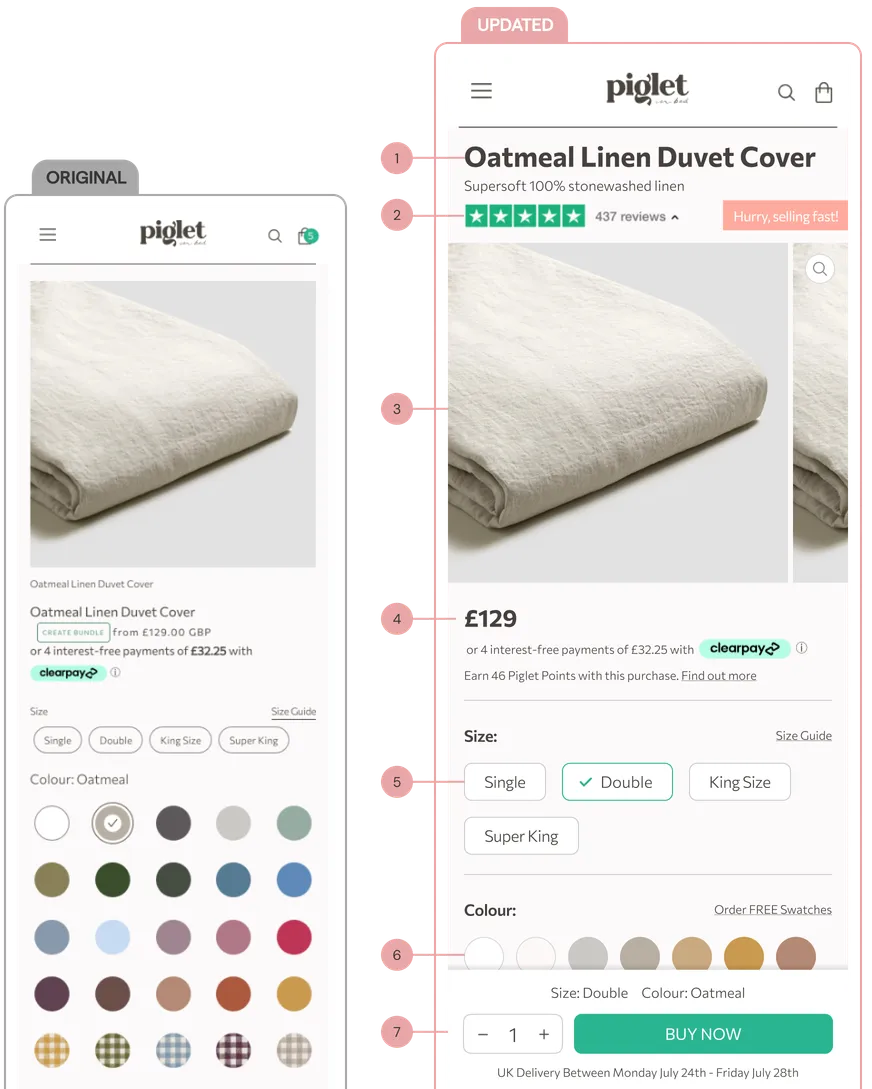
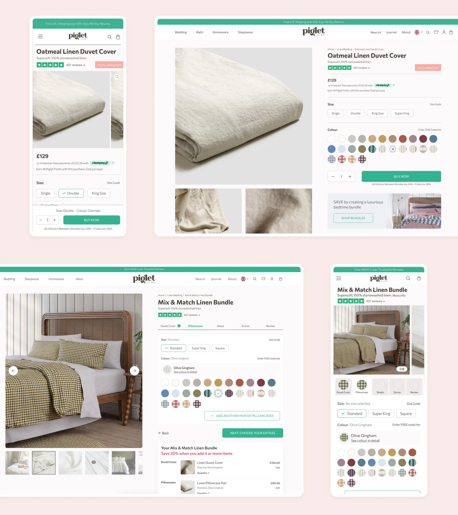
Add product storytelling to PDPs
The “above-the-fold” area of the product page benefitted from some CRO best practice techniques, making title, price, product reviews and delivery information more obvious.
To tackle customer doubts about product, I added editorial content to the lower section of the product pages, based on the chosen material.
See more below
Add delight to bundle building
Based on the user feedback acquired, Piglet in Bed took our advice to create layered CG imagery which would build to show a live example of the options a customer has selected.
We also redesigned the UI with the following optimisations:
- to be more intuitive with clearer buttons and call-to-actions
- to allow for extra sheets or pillowcases
- to incentivise customers to add more products with discounting
(New bundle builder still in development)
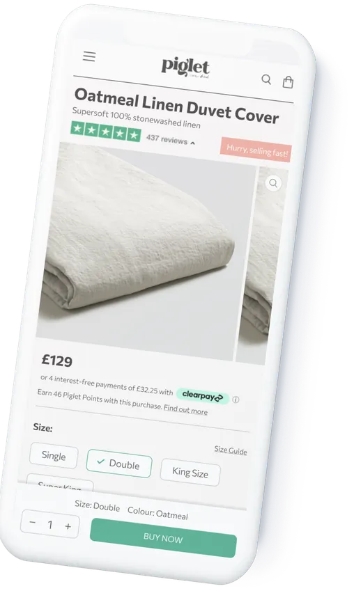
Mobile Product Page
Existing design takes up a lot of space on a mobile screen. Content above the fold needs to be clear, concise and persuasive.
- Clear title with subtitle to give high level summary
- Product reviews to give reassurance and social proof
- Image carousel with clear indication to users that they can scroll and zoom
- Clearer price aids customer clarity, increasing conversion, as shown in studies by Baymard Institute and Nielsen Norman Group
- Larger buttons to give adequate hit area, also adding clearer indication of selected status
- TO A/B test: when customer arrives via a route with colour already stated, close colour swatches by default to reduce cognitive load
- Sticky add-to-cart to keep call to action in view as customer scrolls
Add to cart rate
(from initial PDP redesign)
User conversion rate
(from adding filters and PDP updates)
"We have been consistently impressed with WIRO, who have shown not only expertise, but also flexibility and drive. Their design and UX feedback is always on point and their suggestions have produced tangible benefits to the site."
Jonathan TurtonEcommerce Manager, Piglet in Bed